


Business Intelligence
Various Power BI and Microsoft Excel dashboards & reports
For confidentiality, all original business data has been substituted with carefully designed mock data or blurred, ensuring the integrity and practicality of each example.

Google Ads Power BI Report
Key insights to optimize advertising strategies:
Audience Insights: Identify high-converting audience segments.
Cost Efficiency: Track Cost per Conversion (CPC) and Cost per Click (CPC).
Cost Savings: Spot expensive search terms with zero conversions.
Ad Performance: Review overall ad metrics like impressions, clicks, CTR, and CPM.
Detailed Drill Down: Analyze data by Campaign, Ad Group, Keywords, and Search Terms
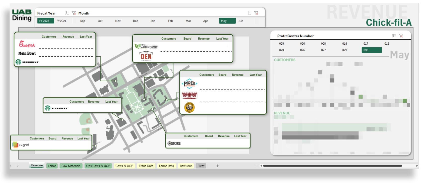
Campus Dining P&L Performance Map
Explore at-a-glance KPIs—and drill down on demand—for every campus restaurant.
Map-Based Snapshots: month-to-date P&L line items
Full P&L Coverage: Track customer transactions alongside Labor Cost, Raw Materials (perishable & non-perishable), Operating Expenses, and Profit/UOP in one workbook.
Time-Slice Analysis: View sales and traffic in 15-minute increments, plus roll-ups by month, week, and day of week.
Peak-Hour Identification: Instantly see high-traffic periods to fine-tune staffing and production.
Shift-Based Labor View: Separate visuals for Daytime and Evening shift labor to spotlight productivity.
Drill-Down Enabled Charts: Many visuals (e.g., hourly customer flow, budget-vs-actual bars) let users zoom from summary to detail.
Brand-Aligned Design: University colors, conditional-format variance bars, and clean fonts keep insights clear and on-brand.
Navigation Overview
Revenue – Detailed sales and variance metrics
Labor – Cost, hours, and productivity
Raw Materials – Perishable vs non-perishable spend
Ops Costs – Operating expenses breakdown
Profit – Unit Operating Profit with variances to previous year
Raw Data – Under-the-hood dataset for power users
Pivot – Pre-built pivot tables for ad-hoc analysis
Use slicers for Fiscal Year and Month to refresh the entire dashboard instantly and focus on the period that matters most. Use the Profit Center Number slicer to focus on particular campus locations.
Retail Dining Sales & Customer Traffic
Explore detailed sales and customer insights for a retail dining business.
Traffic & Sales Trends: View sales and customer counts in 15-minute intervals throughout business hours.
Monthly, Weekly, Daily Metrics: Analyze customer and sales data by month, week, and day of the week.
Peak Hours Identification: Identify peak hours for each selected day to optimize staffing and operations.
Labor: Visual data divided by shifts for labor purposes - Daytime (10:30 AM - 4:00 PM) and Evening (4:15 PM - 10:00 PM) .
Navigation Panel Overview
Easily navigate through the dashboard using the panel on the left, which includes:
Sales: Detailed sales data.
Customers: Customer metrics and insights.
Raw Data: Comprehensive dataset for in-depth analysis.
Pivot: Pivot tables for visual summaries.
Utilize slicers to filter by Year, Month, and Date for customized views.
Product Movement
Explore the detailed Product Movement Dashboard for a restaurant. This Power BI dashboard provides insights into:
Sales Breakdown: Analyze sales data by Year, Month, Day, Date, Product, Quantity Sold, and Revenue.
Top 10 Products: Identify the top 10 products based on selected Year, Month, Day, and Date.
Monthly Sales Trends: View total quantity sold by month.
Weekly Sales Distribution: See the percentage of sales by day of the week.
Product Category Insights: Cards display quantities sold for chicken, beef, steak, tofu, and veggie products.
Side Item Analysis: Includes data on "Make it a meal," queso cheese, and guacamole side orders.
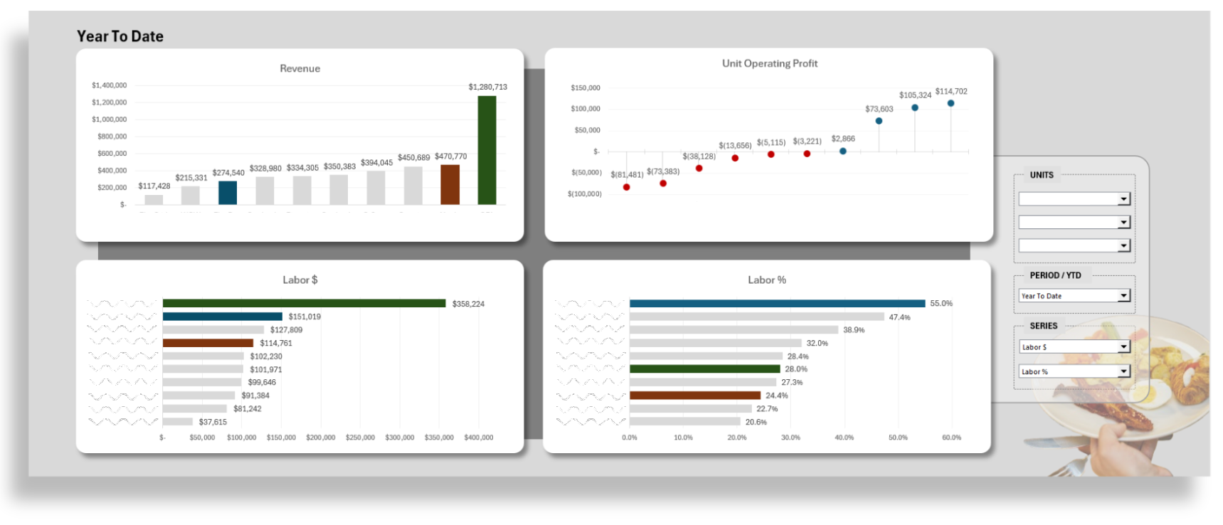
Multi-Unit Performance
High-level operational visibility for scaling retail portfolios.
Gain a bird’s-eye view of your entire portfolio while maintaining the ability to pinpoint individual unit performance. This dashboard transforms complex financial data into a streamlined visual narrative, focusing on the core drivers of profitability: Revenue, Labor, and Material costs.
Holistic Financial Snapshots: Monitor Year-To-Date (YTD) and monthly performance across Revenue and Unit Operating Profit (UOP) to identify top performers and units requiring intervention.
Dynamic Performance Highlighting: Use the Unit selector to instantly spotlight specific locations within the broader dataset, allowing for rapid benchmarking against company averages.
Cost Control Series: Toggle between different financial levers—including Labor, Raw Materials, and Perishable Inventory—to visualize spend in both absolute dollars and as a percentage of revenue.
Profitability Trend Tracking: A dedicated Unit Operating Profit visual uses color-coded indicators to track the transition from loss-recovery to high-margin operations.
Efficiency Analysis: Compare labor costs alongside revenue to ensure staffing levels are optimized relative to sales volume across different locations.
Clean, Insight-Driven Design: Leverages intuitive bar charts and scatter plots with conditional formatting to make variances and outliers stand out at a glance.
Navigation & Filters
Units: Select specific retail locations to highlight their data points across all charts.
Period / YTD: Toggle the entire dashboard view between Month-to-Date and Year-to-Date perspectives.
Series Selectors: Customize the bottom visualizations to focus on the metrics that matter most:
Labor: View total spend ($) or labor as a % of revenue.
Raw Materials: Track cost of goods ($) and efficiency (%).
Perishable Inventory: Monitor waste and inventory management through spend and percentage metrics.
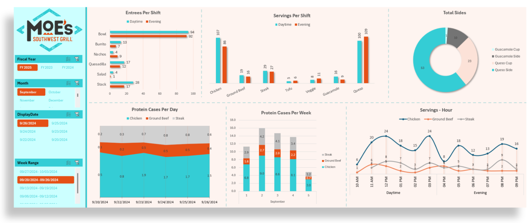
Product Movement & Prep Analytics
Optimize inventory and production with granular, shift-level usage data.
This dashboard provides a deep dive into product movement and consumption patterns, bridging the gap between sales and the supply chain. By tracking exactly what is being served—and when—operators can align prep schedules with actual demand and reduce costly waste.
Entree & Meal Type Analysis: Track the volume of specific menu items (Bowls, Burritos, Stacks, etc.) with a side-by-side comparison of Daytime vs. Evening shift performance.
Protein Utilization Tracking: Monitor the movement of core proteins—like Chicken, Ground Beef, and Steak—expressed in both servings per shift and cases of product used.
Inventory Velocity: View product usage through multiple lenses, including Protein Cases Per Day (stacked area charts for daily trends) and Protein Cases Per Week to assist with more accurate truck ordering.
Hourly Demand Curves: Visualize "Servings per Hour" to identify peak production times, ensuring your team is prepped and ready for the 12:00 PM and 6:00 PM rushes.
Side & Add-on Breakdown: A dedicated distribution view for high-margin sides like Guacamole and Queso cups versus sides, helping to manage portion control and inventory of peripherals.
Navigation & Control
Temporal Precision: Drill down into specific performance windows using slicers for Fiscal Year, Month, and Week Range.
Daily Snapshots: Use the Display Date selector to pull a granular report for a single day of operation to audit specific shift performance.
Visual Integration: Features brand-aligned aesthetics and clear iconography for immediate recognition of product categories.
Operational Use Case
Production Planning: Use the "Servings per Shift" data to adjust par levels between lunch and dinner, ensuring you aren't over-prepping Steak for a slow evening or running out of Chicken during a heavy lunch.